Why does this site look like this?
what I tell people: I am a firm believer that I shouldn't choose how you see my website because everyone has different preferences and I don't feel comfortable choosing for others.
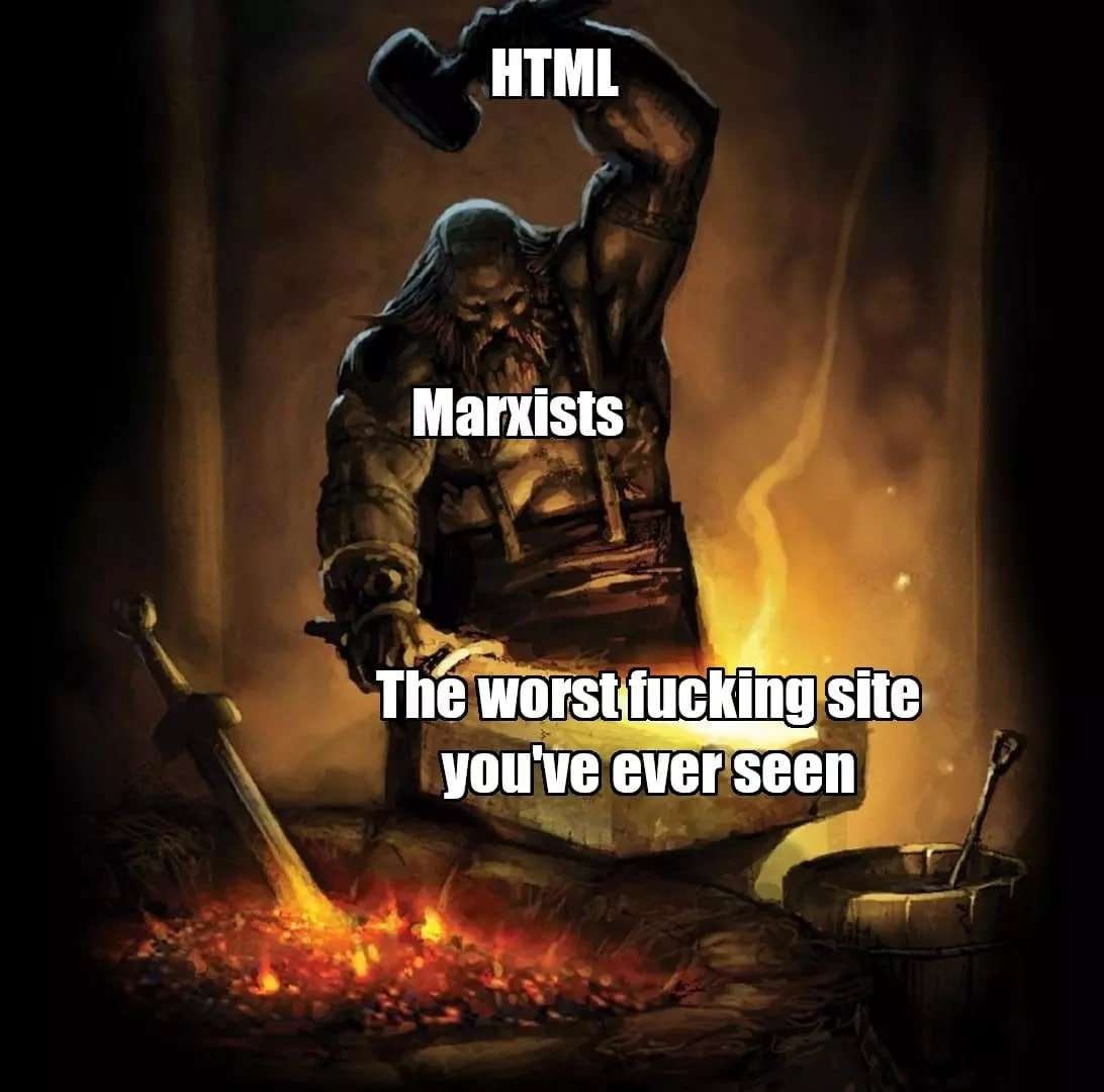
the truth: I don't know anything about webdev and don't like most people that come out of it.
I encourage you to find the font and colour palette that is the least tiring for you to read possible <3.
here's your navigation buttons, as much as I find them silly.
Main Page